Webflow
Usability study, feature design
Duration
June 2023 - July 2023
Team
Paige Heatherington
Kayla Canama
Daisy Mills
Milana Shubina
Roles
Feature design
User interviews
User research
OVERVIEW
For a senior design evaluations course, I conducted usability studies along with 4 other teammates, where participants were asked to perform 4 tasks: Set up the page, Adjust the type, Adjust the image, and Adjust the button. We decided on these as they are the common procedures for any type of website building and can be executed by both novice and experienced users.
THE PROBLEM
Layout manipulation is challenging.
We tested on 8 users.
5/8 of our participants had experience with website builders.
3/8 of our participants had coding experience.
4/8 of our participants had built a website before.
Between our user testing participants, we had them perform four tasks that
pertained the Webflow's core function of getting users to set up a new site
and adding elements:
1. Set up the page,
2. Adjust the type,
3. Adjust the image,
4. Adjust the button.
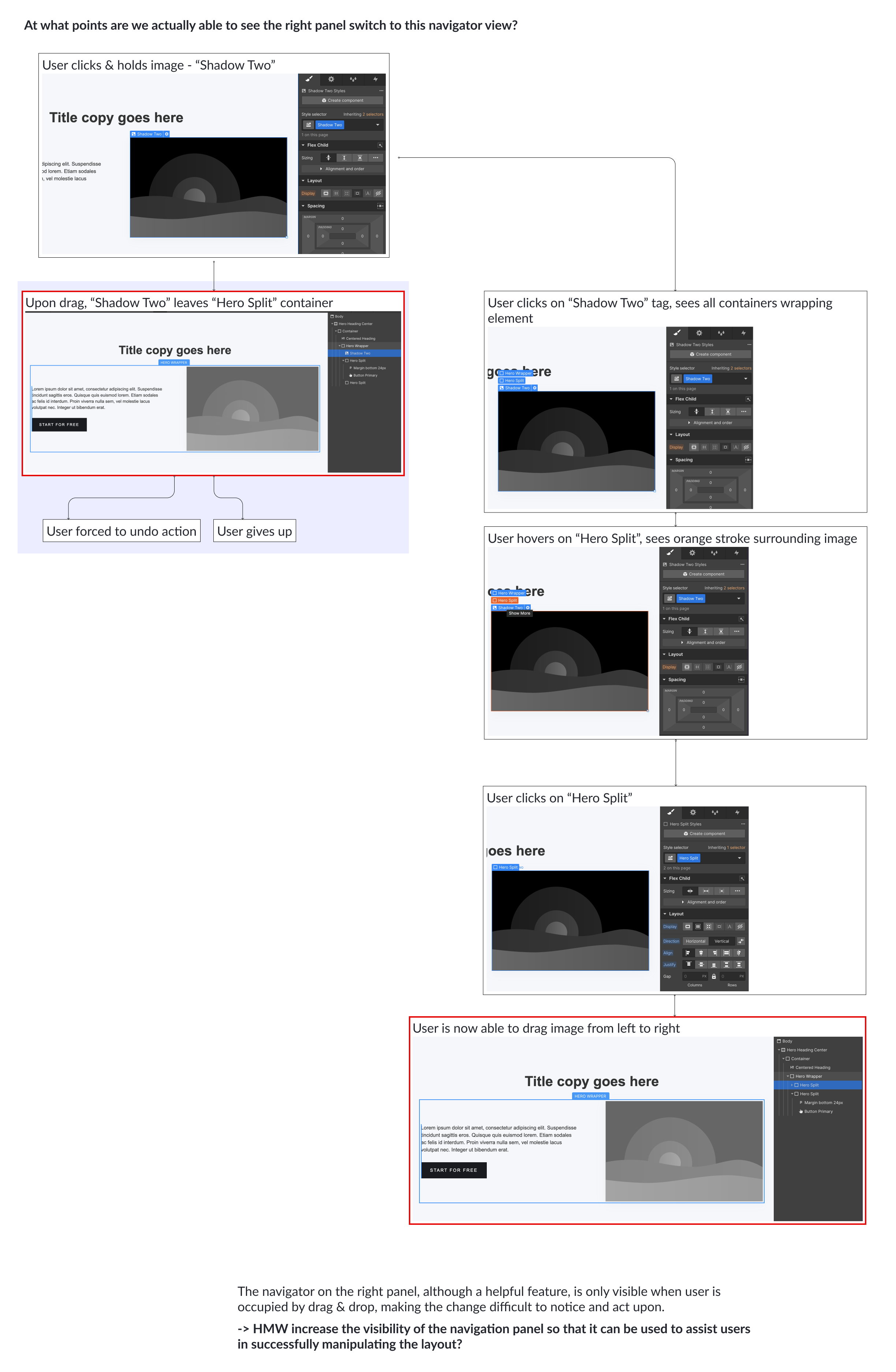
In particular, I was focused on a problem pertaining to #3: Adjusting images.
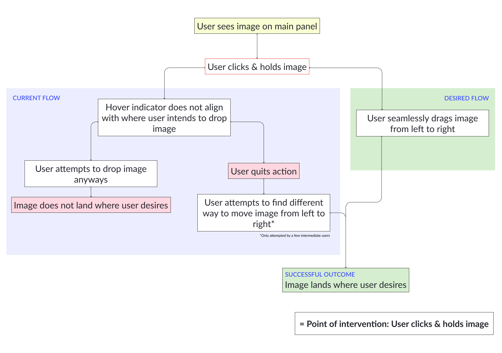
When instructed to move an image from left to right, users would attempt to drag-and-drop.
However, most users would struggle to place the image in the desired spot, as
demonstrated below.
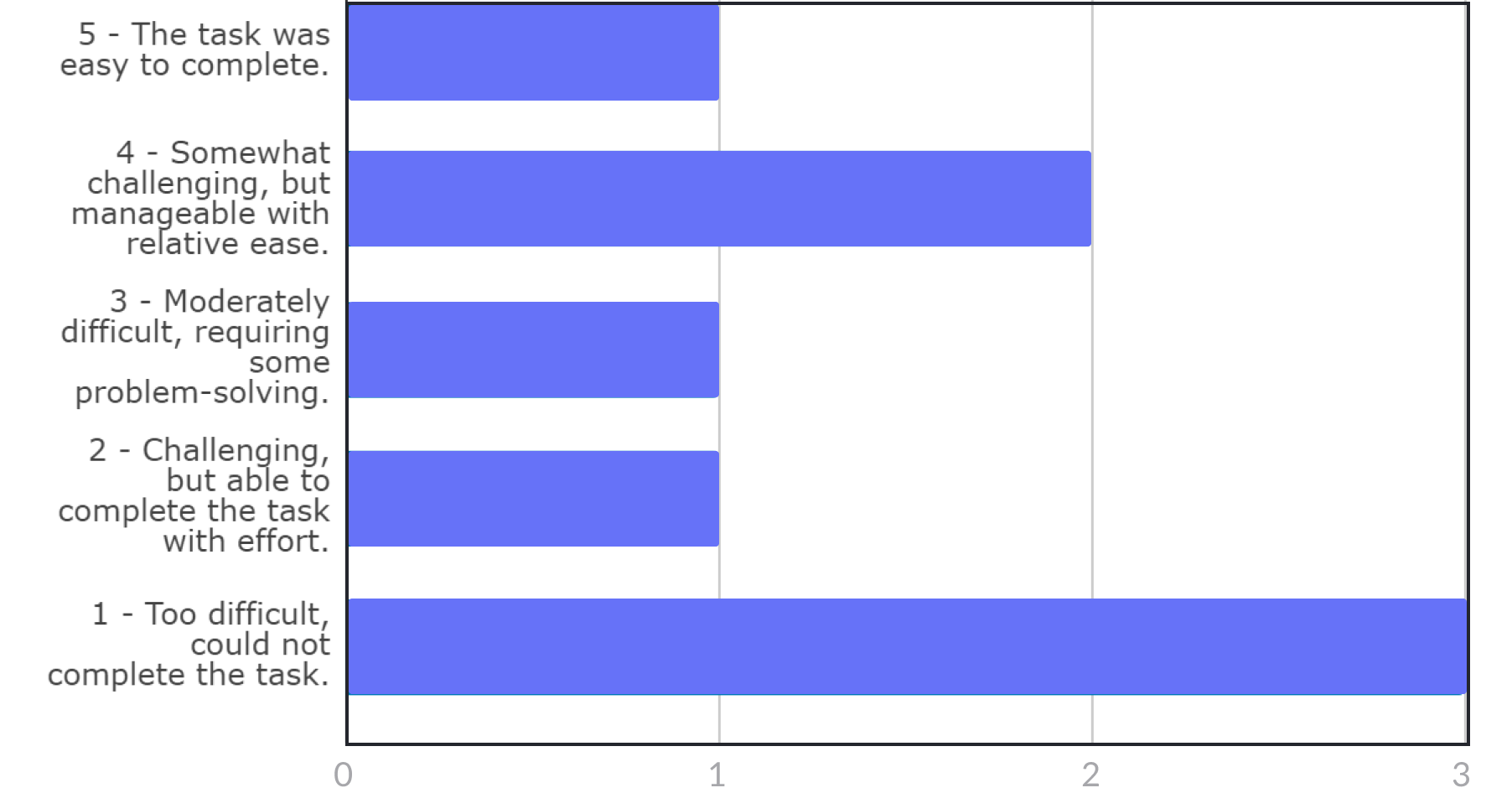
6/8 of our participants were affected by this issue regardless of skill level and experience. Resolution of this issue was divided between either failure to complete the task, or recovery by discovering a way to move the image that was not drag and drop. As this issue results in possible task failure even for intermediate-level users, we believe this should be assigned a high severity level.
3 interviewees answered that this task was impossible to complete. Overall, a majority of people felt like moving images was a somewhat challenging task.
INITIAL FRAMING
"HMW increase the visibility of the navigation panel so that it can successfully assist layout manipulation?"
Choosing a point of intervention
Before ideating solutions, I created a flow chart to fully understand where an appropriate point of intervention was. This chart was a visualization of the common scenario in which users went through when tasked to adjust images. The current flow was contrasted with the shortest route to task completion, which would be the ideal scenario for us.
After identifying at what point our given tasks were failing, I created a
similar flowchart again to contrast the typical failure scenario and a
successful scenario.
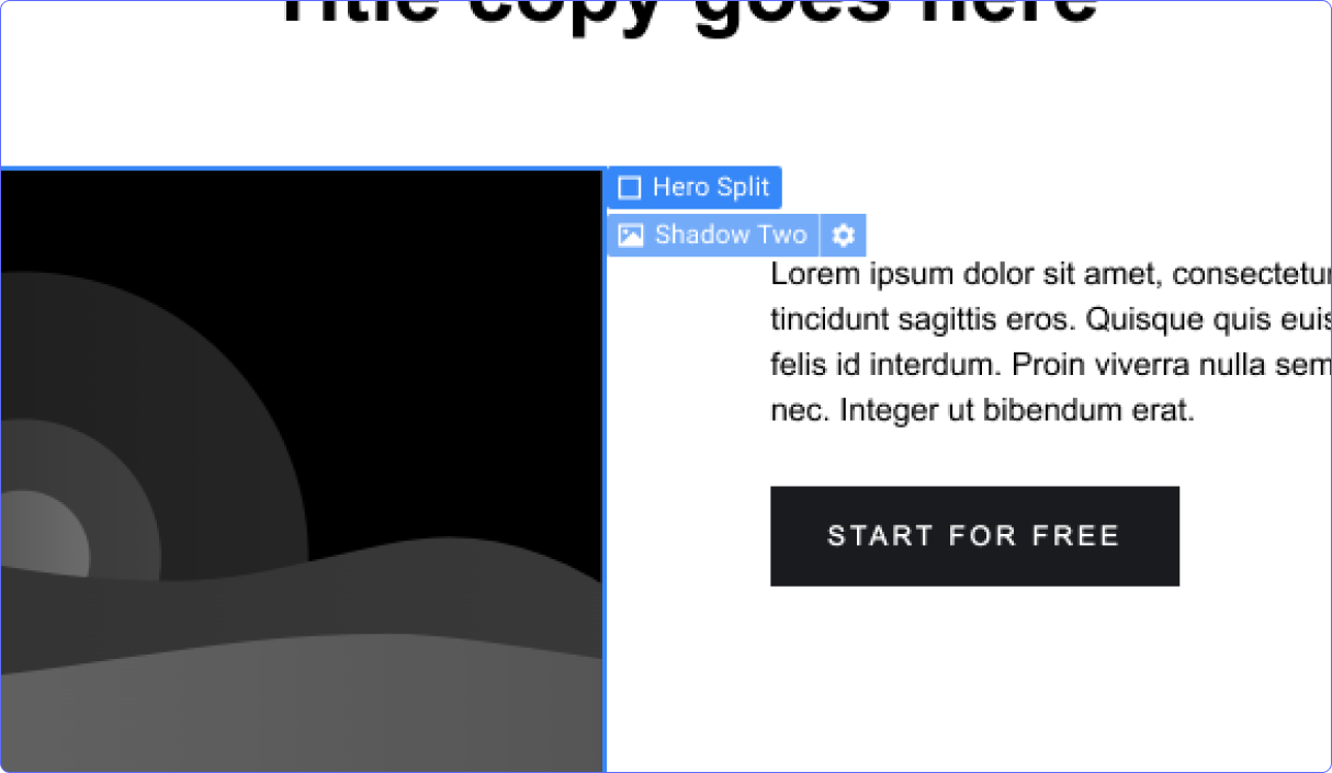
With the existing Webflow UI, images typically come wrapped in a "Div" element
container, which is not visible to novice to intermediate users who are not anticipating
this sort of setup. Thus, when users opt to drag and drop images, the cursor
would take the image out of the 'div' container and place it in another, even
when users mentally intend to grab the whole div container and swap its place.
The less techincal summary of the problem is that because there are multiple
invisible layers on webflow, users are unable to see what elements they are actually
selecting when interacting via drag-and-drop.
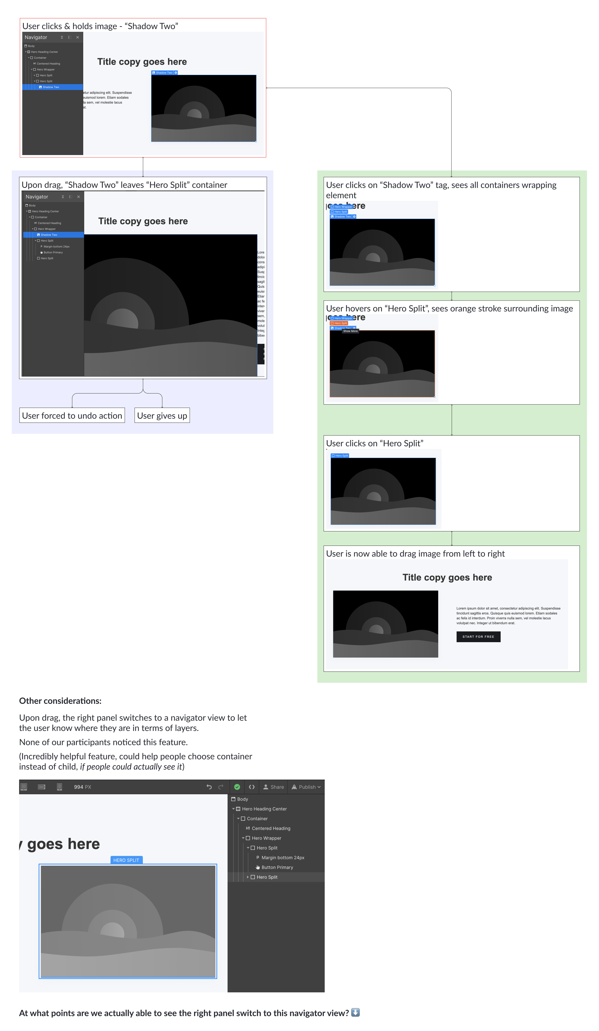
What I noticed was that Webflow already provides a solution to this problem - the platform's right panel switches from a general view to a 'layers' view when users click on an element. While helpful, this view would only appear when users are occupied by their attempt to drag-and-drop, which made it go virtually unnoticed during our user testing sessions.
SOLUTION
Creating a 'mini' navigation panel next to mouse pointer
In this solution, we expand upon the pre-existing element labels and add the
navigation functionality to it. When users hover over elements, they are
able to see all available layers affecting the particular element they see.
This utilizes a solution that Webflow already has and increases the visibility
of it, so that it is better integrated into the user's task flow.